Streamlining an ERP talent management system: a full UX overhaul
Streamlining an ERP talent management system: a full UX overhaul
📁 Project Overview
📁 Project Overview
This case study covers a project to address low usage of an ERP module for HR and talent management that faced high churn and low engagement despite its intended value.
This case study covers a project to address low usage of an ERP module for HR and talent management that faced high churn and low engagement despite its intended value.
🎯 Goals
🎯 Goals
Increase user adoption and engagement of the ERP talent management module
Increase user adoption and engagement of the ERP talent management module
Reduce churn rates by improving user experience and addressing pain points
Reduce churn rates by improving user experience and addressing pain points
Enhance the module’s features to better meet the needs of HR and talent management professionals
Enhance the module’s features to better meet the needs of HR and talent management professionals
👩🏻💻 Role
👩🏻💻 Role
Led research efforts throughout the entire project lifecycle
Led research efforts throughout the entire project lifecycle
Contributed significantly to the platform’s UX and visual design
Contributed significantly to the platform’s UX and visual design
Validated design decisions through continuous iteration and user feedback
Validated design decisions through continuous iteration and user feedback
Original design
Final iteration
Original design
Final iteration
Original design
Final iteration
getting to know the problem
getting to know the problem
What we wanted to discover
What we wanted to discover
Our goals were to identify inefficiencies within the ERP platform, uncover how users expected the platform to work, and guide the redesign process with research-backed insights.
Our goals were to identify inefficiencies within the ERP platform, uncover how users expected the platform to work, and guide the redesign process with research-backed insights.

What methods we used
What methods we used
We began with exploratory interviews with stakeholders, followed by semi-structured interviews with employees, and finally did an in-depth analysis of internal user feedback.
We began with exploratory interviews with stakeholders, followed by semi-structured interviews with employees, and finally did an in-depth analysis of internal user feedback.
Setting goals
Setting goals
As a team, we developed three research questions to clearly define our objectives to stakeholders
As a team, we developed three research questions to clearly define our objectives to stakeholders
1.
1.
Why do so few users engage with the platform despite its intended benefits?
Why do so few users engage with the platform despite its intended benefits?
2.
2.
How do users perceive the platform and its functionality?
How do users perceive the platform and its functionality?
3.
3.
What features or functions of the platform do users find agreeable?
What features or functions of the platform do users find agreeable?
Interviewing stakeholders and employees
Interviewing stakeholders and employees
I conducted exploratory interviews with stakeholders, followed by semi-structured interviews with five employees to explore their daily challenges and priorities.
I conducted exploratory interviews with stakeholders, followed by semi-structured interviews with five employees to explore their daily challenges and priorities.
Key insights
Key insights
These are the main takeaways from the user and stakeholder interviews.
These are the main takeaways from the user and stakeholder interviews.
general UX issues
Discussions confirmed that the interface and search function were contributing significantly to user frustrations.
Discussions confirmed that the interface and search function were contributing significantly to user frustrations.
unpredictable behaviour
There was a big mismatch between how the users expected the platform’s core features to work and how they actually worked.
There was a big mismatch between how the users expected the platform’s core features to work and how they actually worked.
filtering issues
Several issues with the filtering system were uncovered and valuable data was collected to better understand the problem.
Several issues with the filtering system were uncovered and valuable data was collected to better understand the problem.
expectations not met
Employee expectations were that using the platform would quickly lead to finding new candidates for projects, which did not happen.
Employee expectations were that using the platform would quickly lead to finding new candidates for projects, which did not happen.
Stakeholder confirmation
Stakeholders confirmed users were having trouble with the platform’s interface and search functions
Stakeholders confirmed users were having trouble with the platform’s interface and search functions
Onboarding troubles
New hires have a hard time learning how to use the platform and often need to ask for help from more senior colleagues
New hires have a hard time learning how to use the platform and often need to ask for help from more senior colleagues
Interview highlights
Interview highlights
These are some of the key highlights from the employee interviews.
These are some of the key highlights from the employee interviews.
“It just feels really overwhelming at times. The search bar is hidden behind a dropdown, and often I can't even find it. It's hidden and I don't understand why. Can't it just be visible?”
“It just feels really overwhelming at times. The search bar is hidden behind a dropdown, and often I can't even find it. It's hidden and I don't understand why. Can't it just be visible?”
“I usually can’t find the right filter. The screen also goes blank sometimes after searching, and I'm not sure why. It makes me worried I’m doing something wrong."
“I usually can’t find the right filter. The screen also goes blank sometimes after searching, and I'm not sure why. It makes me worried I’m doing something wrong."
"I just wish the platform worked like I expected it to. I've used similar platforms before and they all worked a certain way. This one doesn't."
"I just wish the platform worked like I expected it to. I've used similar platforms before and they all worked a certain way. This one doesn't."
defining the issues
defining the issues
Turning raw data into insights
Turning raw data into insight
We coded and categorized all research data, uncovering five distinct themes.
We coded and categorized all research data, uncovering five distinct themes.

Telling a story
Telling a story
I used the data to create a journey map that highlighted pain points and opportunities, helping stakeholders visualize how these issues disrupted workflows.
I used the data to create a journey map that highlighted pain points and opportunities, helping stakeholders visualize how these issues disrupted workflows.

Answering our questions & conclusions
Answering our questions & conclusions
Users avoided the platform due to usability issues and the perception of broken functionality. However, they highly valued the core feature of easily finding candidates.
Users avoided the platform due to usability issues and the perception of broken functionality. However, they highly valued the core feature of easily finding candidates.
Finding the search bar is hard and using it causes frustration
Finding the search bar is hard and using it causes frustration
Users miss the search bar because it’s not visually distinct
Users miss the search bar because it’s not visually distinct
There is no guidance or feedback when using the search function
There is no guidance or feedback when using the search function
Invalid searches lead to a blank page offering no explanations
Invalid searches lead to a blank page offering no explanations
Filters should help refine searches, not get in the way
Filters should help refine searches, not get in the way
Lack of filter visibility leads to confusion about which filter is active
Lack of filter visibility leads to confusion about which filter is active
Filter interactions are inconsistent and don’t work as intended
Filter interactions are inconsistent and don’t work as intended
Users can’t easily find out which filters they selected
Users can’t easily find out which filters they selected
The UI requires too much mental load to navigate
The UI requires too much mental load to navigate
Poorly constructed visual hierarchy, driving focus away from what’s important
Poorly constructed visual hierarchy, driving focus away from what’s important
Users feel overwhelmed due to the high number of elements on the screen
Users feel overwhelmed due to the high number of elements on the screen
The layout feels static and doesn’t adapt to user preferences
The layout feels static and doesn’t adapt to user preferences
prototyping and testing
prototyping and testing
From insights to action
From insights to action
Before coming up with solutions, we created a problem statement to better frame the challenges we faced.
Before coming up with solutions, we created a problem statement to better frame the challenges we faced.
Problem statement
Employees struggle with core features and a complex UI, leading to task failures. Simplifying the interface and improving key features can reduce frustration and boost adoption.
Employees struggle with core features and a complex UI, leading to task failures. Simplifying the interface and improving key features can reduce frustration and boost adoption.
An overview of the platform’s design
An overview of the platform’s design
Users often missed the search and filter bars due to poor visual hierarchy. The filter bar, for example, was hidden behind a small, easily overlooked blue button.
Users often missed the search and filter bars due to poor visual hierarchy. The filter bar, for example, was hidden behind a small, easily overlooked blue button.

The extent of the clutter
The extent of the clutter
The clutter is apparent with an extended filter bar: there are too many cramped filters.
The clutter is apparent with an extended filter bar: there are too many cramped filters.

Wireframing our solution: Iteration #1
Wireframing our solution: Iteration #1
We held workshops to brainstorm and explore solutions that could address the platform’s issues.
We held workshops to brainstorm and explore solutions that could address the platform’s issues.
Search bar improvements
Search bar improvements
The search bar should be made more prominent to help users locate it easily
The search bar should be made more prominent to help users locate it easily
Filter functionality overhaul
Filter functionality overhaul
Separating and reorganizing the filter bar could improve access and clarity
Separating and reorganizing the filter bar could improve access and clarity
Advanced search manages filters and could be merged with the filter bar for better logic
Advanced search manages filters and could be merged with the filter bar for better logic
We needed to determine if users preferred a customizable or fixed set of filters
We needed to determine if users preferred a customizable or fixed set of filters
Interface enhancements
Interface enhancements
We should minimize interface noise and density to make navigation easier
We should minimize interface noise and density to make navigation easier
We should redesign the empty state to avoid user confusion after failed searches
We should redesign the empty state to avoid user confusion after failed searches
A less overwhelming interface
A less overwhelming interface
We used more white space and added a clear "Filters" button below the search bar.
We used more white space and added a clear "Filters" button below the search bar.

Allowing users to customize the filter bar
Allowing users to customize the filter bar
Inspired by SAP Fiori, I proposed a customizable filter bar using a modal with checkboxes. Users could choose up to four filters to display rather than relying on defaults.
Inspired by SAP Fiori, I proposed a customizable filter bar using a modal with checkboxes. Users could choose up to four filters to display rather than relying on defaults.

Showing selected filters on the page
Showing selected filters on the page
After selecting filters and clicking "Apply filters," the chosen ones appeared on the main page.
After selecting filters and clicking "Apply filters," the chosen ones appeared on the main page.

Stakeholder and employee feedback: Iteration #2
Stakeholder and employee feedback: Iteration #2
Overall feedback was positive, but users and stakeholders wanted simpler filter selection, clearer active filters, quicker removal, and a better layout.
Overall feedback was positive, but users and stakeholders wanted simpler filter selection, clearer active filters, quicker removal, and a better layout.
Filter functionality overhaul
Filter functionality overhaul
Turning selected filters into visual tags simplifies management and speeds removal.
Turning selected filters into visual tags simplifies management and speeds removal.
An overflow indicator could improve interface feedback for active filters
An overflow indicator could improve interface feedback for active filters
A “Clear all” button could be introduced to make it easier to remove all filter selections.
A “Clear all” button could be introduced to make it easier to remove all filter selections.
Interface enhancements
Interface enhancements
Showing common filters by default frees space to move the export button to bulk actions.
Showing common filters by default frees space to move the export button to bulk actions.
Most users search via icon or 'Enter,' so "Search" button could be removed for less clutter
Most users search via icon or 'Enter,' so "Search" button could be removed for less clutter
Implementing feedback
Implementing feedback
We made key filters visible by default, added a "Clear all" button, moved "Export" to bulk actions, and began developing an overflow indicator.
We made key filters visible by default, added a "Clear all" button, moved "Export" to bulk actions, and began developing an overflow indicator.

Less complexity for the modal window
Less complexity for the modal window
We set default filters based on usage and explored a tag-based system for organizing modal filters.
We set default filters based on usage and explored a tag-based system for organizing modal filters.

High-fidelity designs
High-fidelity designs
After validating with users and stakeholders, we moved on to creating high-fidelity wireframes. Before that, we held more workshops to identify further improvements.
After validating with users and stakeholders, we moved on to creating high-fidelity wireframes. Before that, we held more workshops to identify further improvements.
Additional filter enhancements
Additional filter enhancements
Active filters could be highlighted with a contrasting color to improve feedback.
Active filters could be highlighted with a contrasting color to improve feedback.
Visual considerations
Visual considerations
We should refine the interface to better align with the company’s branding and visual style.
We should refine the interface to better align with the company’s branding and visual style.
The search bar placeholder text could be updated to better catch users’ attention.
The search bar placeholder text could be updated to better catch users’ attention.
Color-coding assigned/unassigned status could improve clarity and feedback.
Color-coding assigned/unassigned status could improve clarity and feedback.
Selected profiles could use a contrasting color to improve visual hierarchy.
Selected profiles could use a contrasting color to improve visual hierarchy.
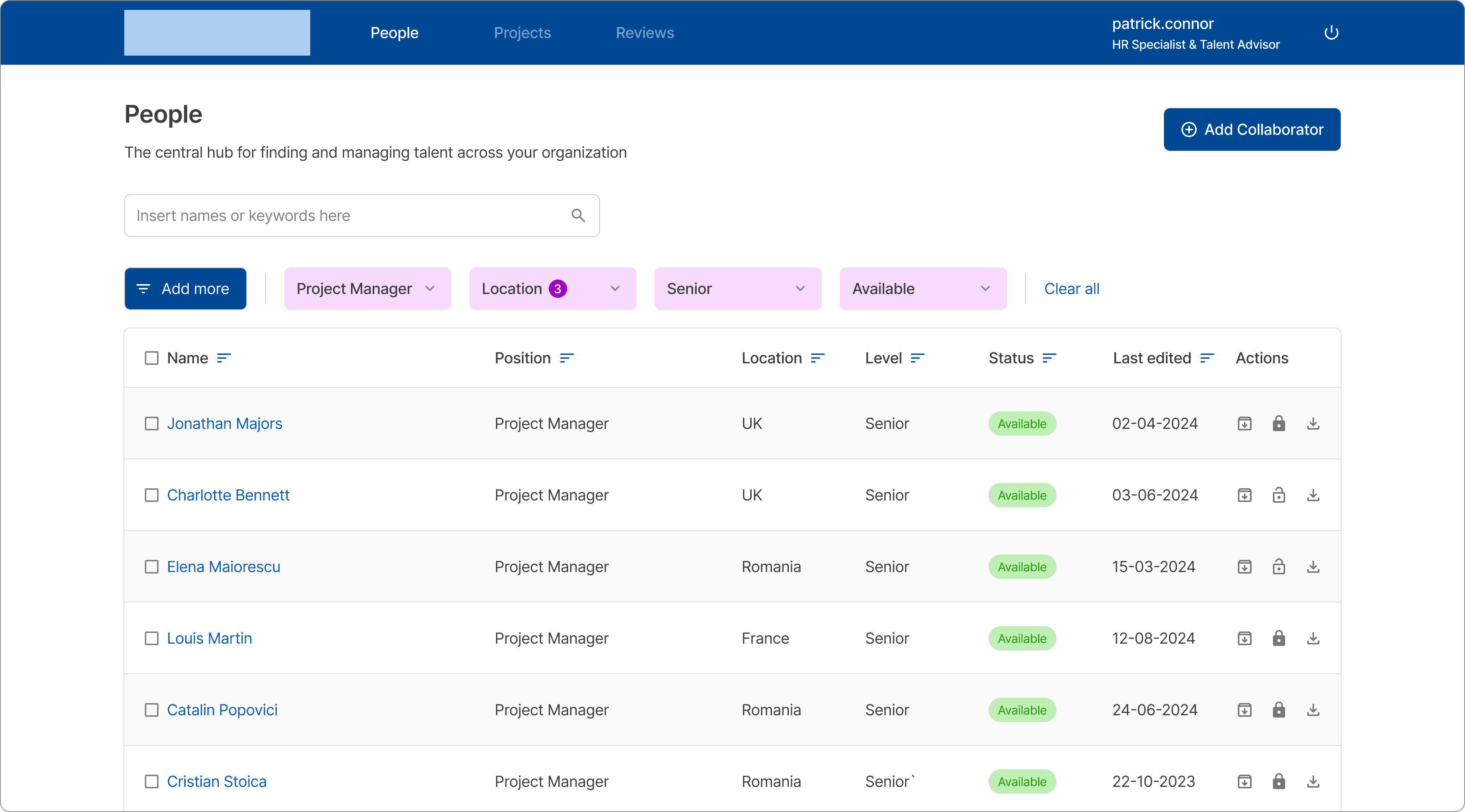
The default state of the "People" page
The default state of the "People" page
The "People" page kept its original style and colors but now highlighted key elements like the "Status" state.
The "People" page kept its original style and colors but now highlighted key elements like the "Status" state.

Guiding users' attention
Guiding users' attention
Selected profiles now use contrasting colors to stand out and enhance visual hierarchy.
Selected profiles now use contrasting colors to stand out and enhance visual hierarchy.

Better interface feedback when filtering
Better interface feedback when filtering
Active filters use contrast and visual cues for quick feedback. Following progressive disclosure principles, the "Clear all" button appears only when filters are applied.
Active filters use contrast and visual cues for quick feedback. Following progressive disclosure principles, the "Clear all" button appears only when filters are applied.

An empty state for failed searches
An empty state for failed searches
The new empty state prevented users from thinking they'd made a mistake if a search failed.
The new empty state prevented users from thinking they'd made a mistake if a search failed.

A new “Add more” modal window
A new “Add more” modal window
The tag system and better color contrast make it easier for users to spot and remove applied filters.
The tag system and better color contrast make it easier for users to spot and remove applied filters.

PROJECT WRAP-UP
PROJECT WRAP-UP
Reflecting on the impact we generated
Reflecting on the impact we generated
Stakeholder feedback showed the ERP redesign boosted user satisfaction and platform approachability.
Stakeholder feedback showed the ERP redesign boosted user satisfaction and platform approachability.

What I learned
What I learned
Working on this project taught me many valuable lessons.
Working on this project taught me many valuable lessons.
📝
📝
Research is crucial to uncovering which issues users have to deal with on a day-to-day basis.
Research is crucial to uncovering which issues users have to deal with on a day-to-day basis.
👤
👤
Stakeholders offer valuable insights so aligning with them early is crucial.
Stakeholders offer valuable insights so aligning with them early is crucial.
🪜
🪜
Focused improvements might have a greater impact on usability than sweeping changes.
Focused improvements might have a greater impact on usability than sweeping changes.
🐙
🐙
Don’t get too attached to your designs, stay adaptable and see the bigger picture.
Don’t get too attached to your designs, stay adaptable and see the bigger picture.
🔍
🔍
Visual clarity directly impacts user trust in a platform.
Visual clarity directly impacts user trust in a platform.
🕹
Giving users more control and better feedback from the interface is key to engagement.
Giving users more control and better feedback from the interface is key to engagement.
🧪
🧪
User testing and feedback-driven design decisions are essential for good design.
User testing and feedback-driven design decisions are essential for good design.
Next steps
Next steps
As a team, we resolved many major issues with the ERP platform. While not all pain points were addressed, our changes increased user trust and satisfaction. Future work could focus on adapting the platform to new use cases and improving scalability for growth.
As a team, we resolved many major issues with the ERP platform. While not all pain points were addressed, our changes increased user trust and satisfaction. Future work could focus on adapting the platform to new use cases and improving scalability for growth.